The 2016 season was the third with the instant replay challenge system. The system allows managers an opportunity to verify umpires’ calls. The goal of the system is to get more calls right, but is also a strategic consideration. I examined how John Farrell and the Red Sox’s coaching staff performed with their challenges. I did so, as I have done previously when evaluating this system, by looking at how the system impacted the primary currency of baseball: runs.
This was a fun one to put together. Check it out at BP Boston: The Red Sox and the Instant Replay Challenge System.
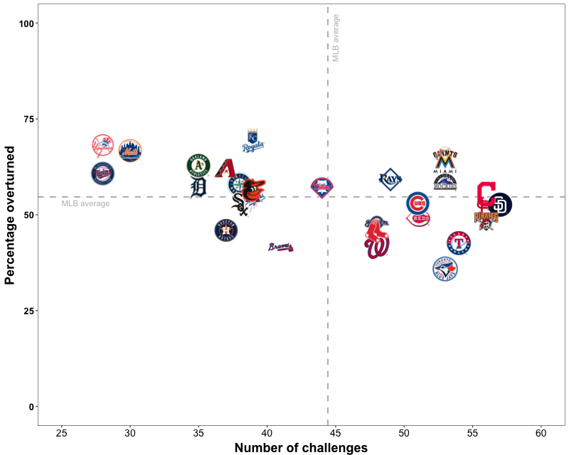
One aspect of the article that I am particularly happy with is getting the figure plotted with team logos as the points. Doing so makes it much easier to find a certain team. In the past I have relied on using a personally selected colour scheme to help differentiate the teams, but it is not an ideal approach, as it can be tricky with so many teams represented by a variant of red. You can see what I mean by comparing the two plots below:
Logos (as in the published article):
Colour scheme (with a few points highlighted with text):
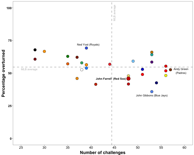
As you can see, the colour scheme gets the job done, but having the logos greatly simplifies things for the reader.
For those interested, below I have shown partial R code to create a plot (using ggplot2) with logos (or other pictures) as the point icon. Important things to consider when adjusting the code:
- Where are your files located? Set this as the working directory (setwd())
- What are your files called? Mine were labelled with the team names, which made referencing them from the data frame easy.
- Square (L = H) .png images is ideal
Here is the partial code (you will need more than this to create an actual plot):
# Necessary Libraries

library(ggplot2)
library(png)

# Plot

setwd("~/where-my-images-are")

img_size = 3.5

plot <- ggplot(data_frame, aes(x = x_var, y = y_var)) +
        geom_point(fill = "white", colour = "white") +
        xlab("X Label") +
        ylab("Y Label") +
        scale_x_continuous() +
        scale_y_continuous() +
        theme_bw() +
        theme(axis.title.x = element_text(face="bold", size=18, vjust=-0.5),
              axis.title.y = element_text(face="bold", size=18, vjust=0.5),
              axis.text.x = element_text(size=14, colour="black"),
              axis.text.y = element_text(face="bold", size=13, colour="black"),
              panel.grid.minor=element_blank(), panel.grid.major=element_blank())

plot +
        sapply(data_frame$var_with_image_name[order(data_frame$another_var, decreasing = T)], function(x) {
                annotation_custom(rasterGrob(readPNG(paste(x,".png", sep="")), interpolate = T),
                                  xmin = data_frame[data_frame$var_with_image_name==x,"x_var"] - img_size,
                                  xmax = data_frame[data_frame$var_with_image_name==x,"x_var"] + img_size,
                                  ymin = data_frame[data_frame$var_with_image_name==x,"y_var"] - img_size,
                                  ymax = data_frame[data_frame$var_with_image_name==x,"y_var"] + img_size)})
Hopefully that makes sense. If not, post a comment below or send me an email and I will clarify.